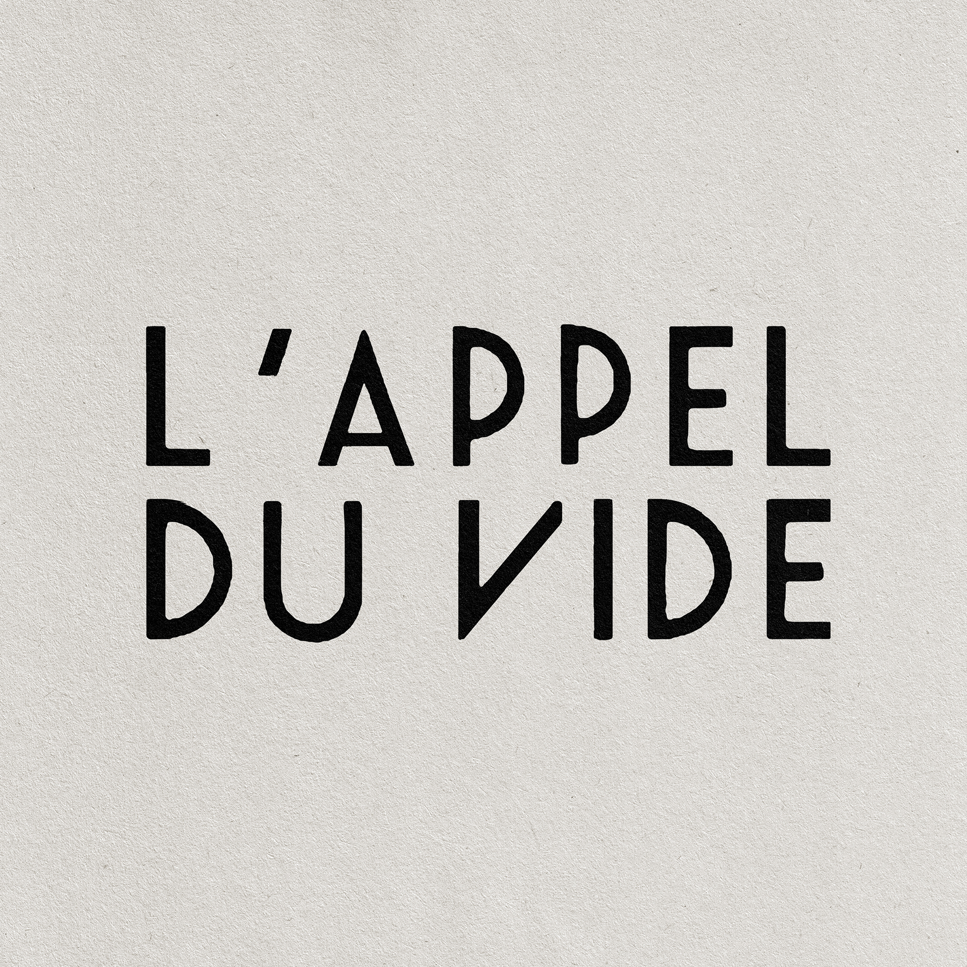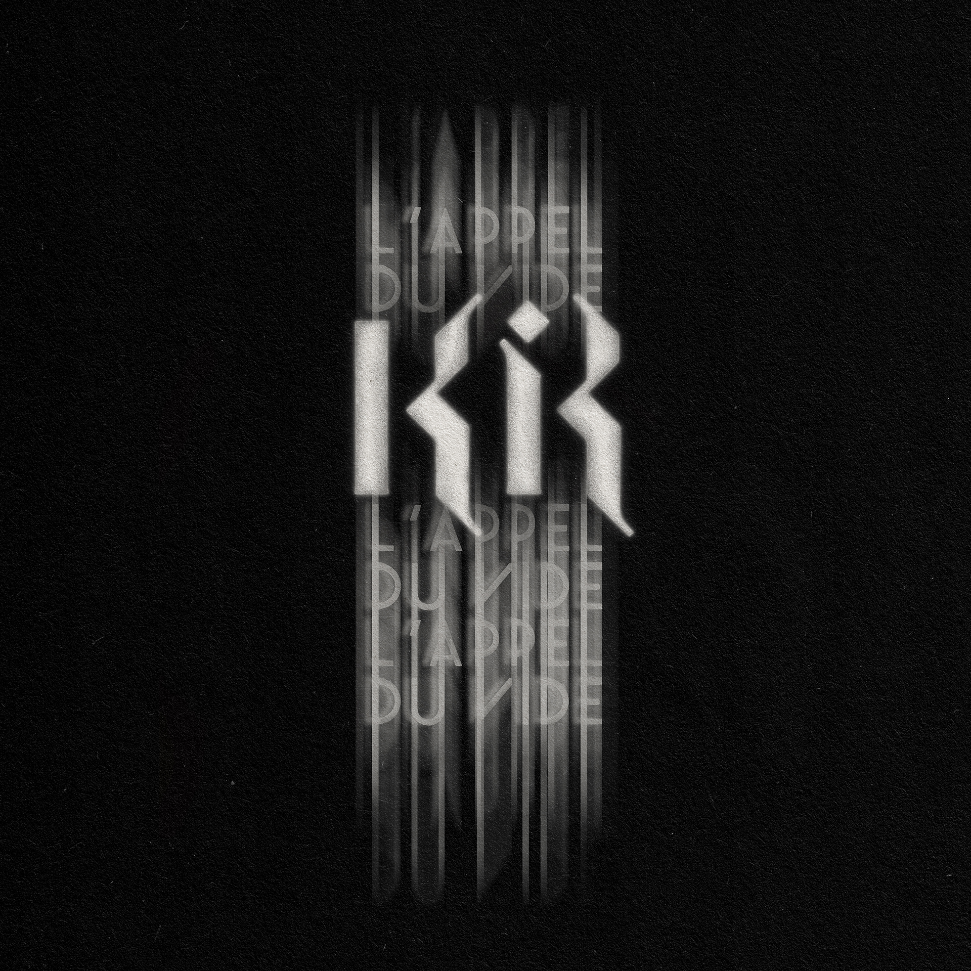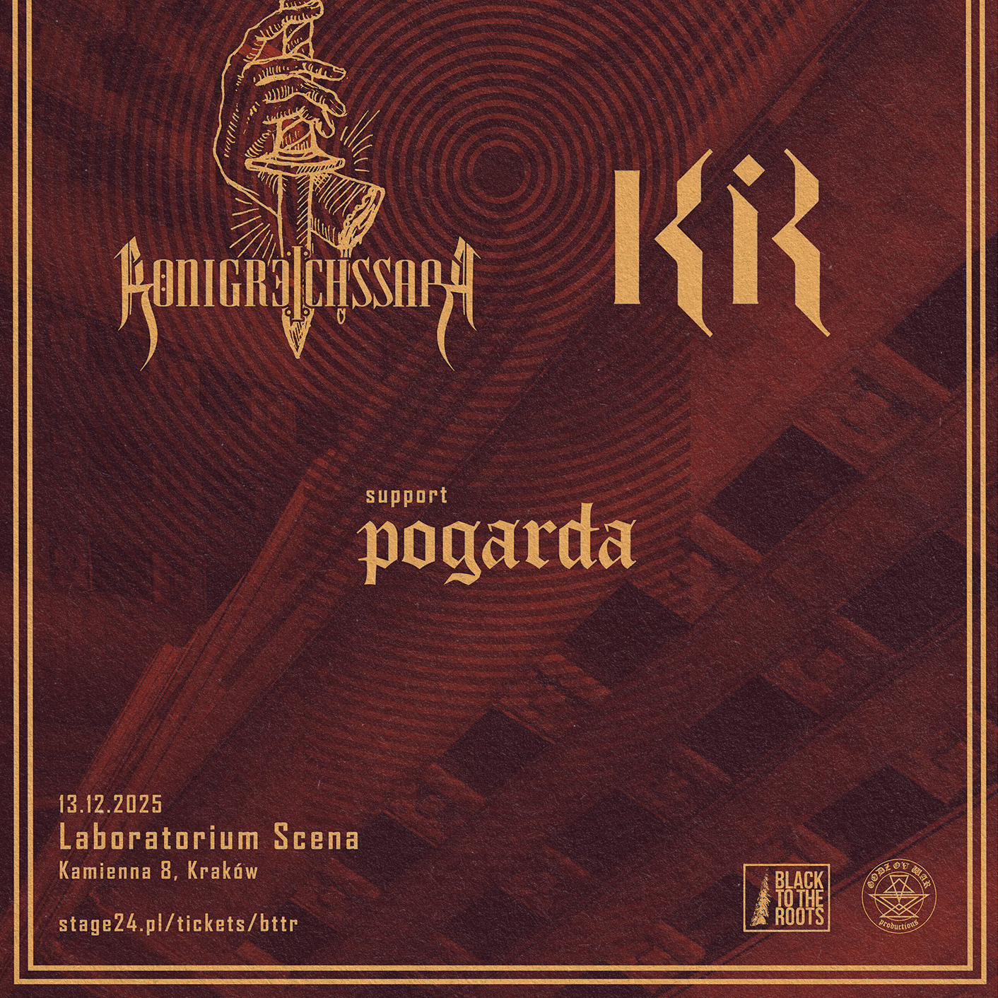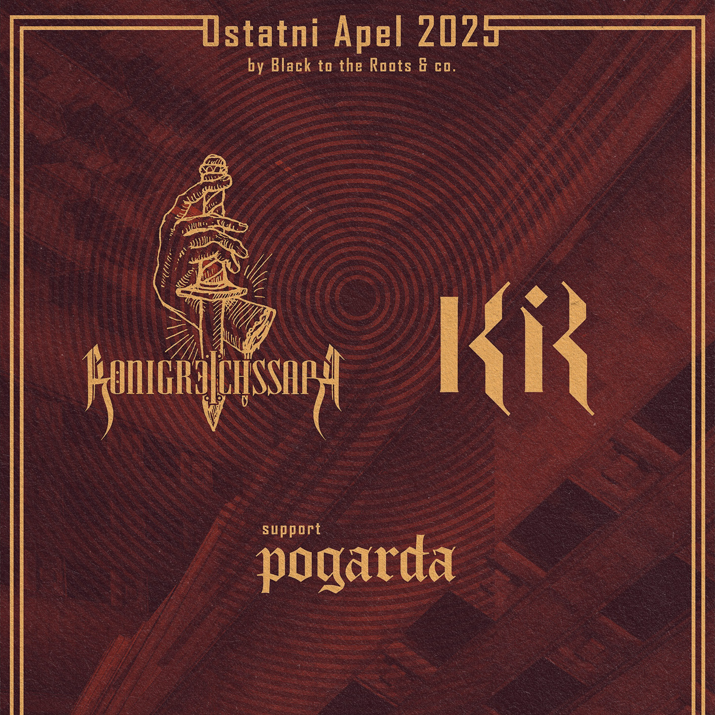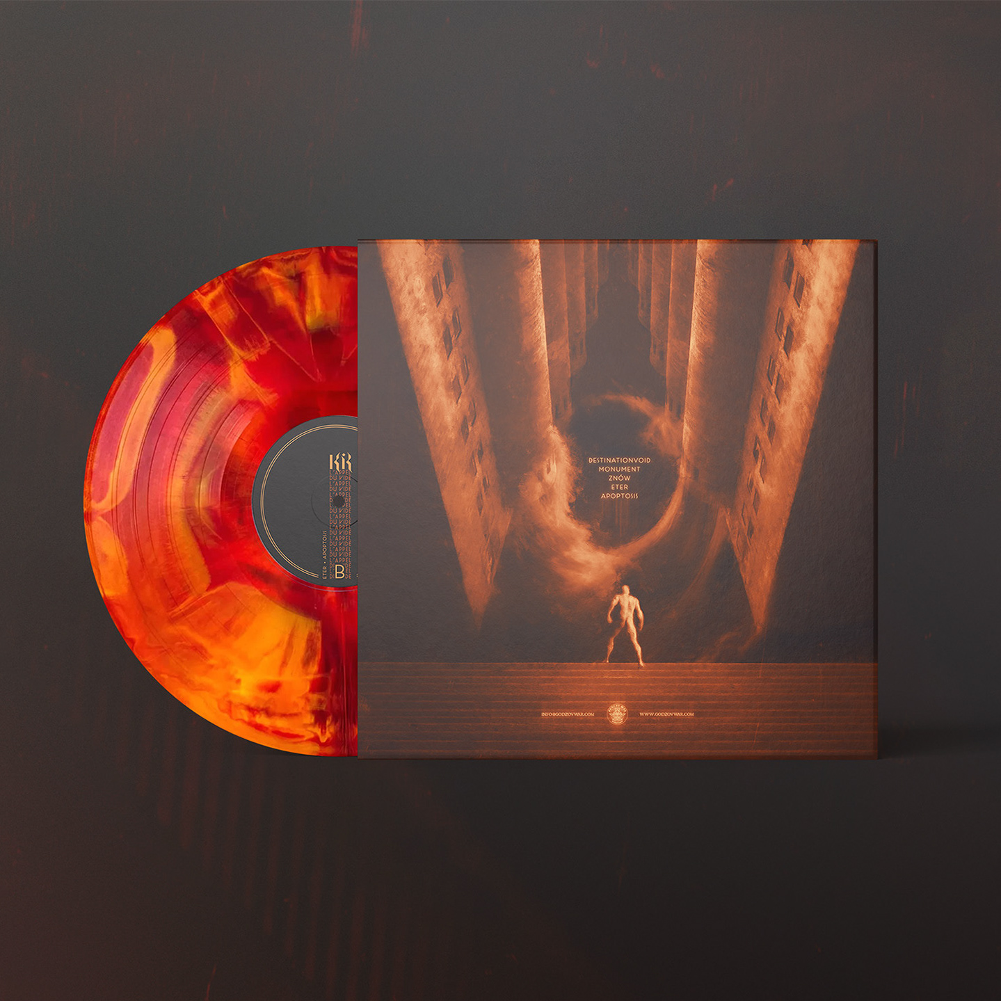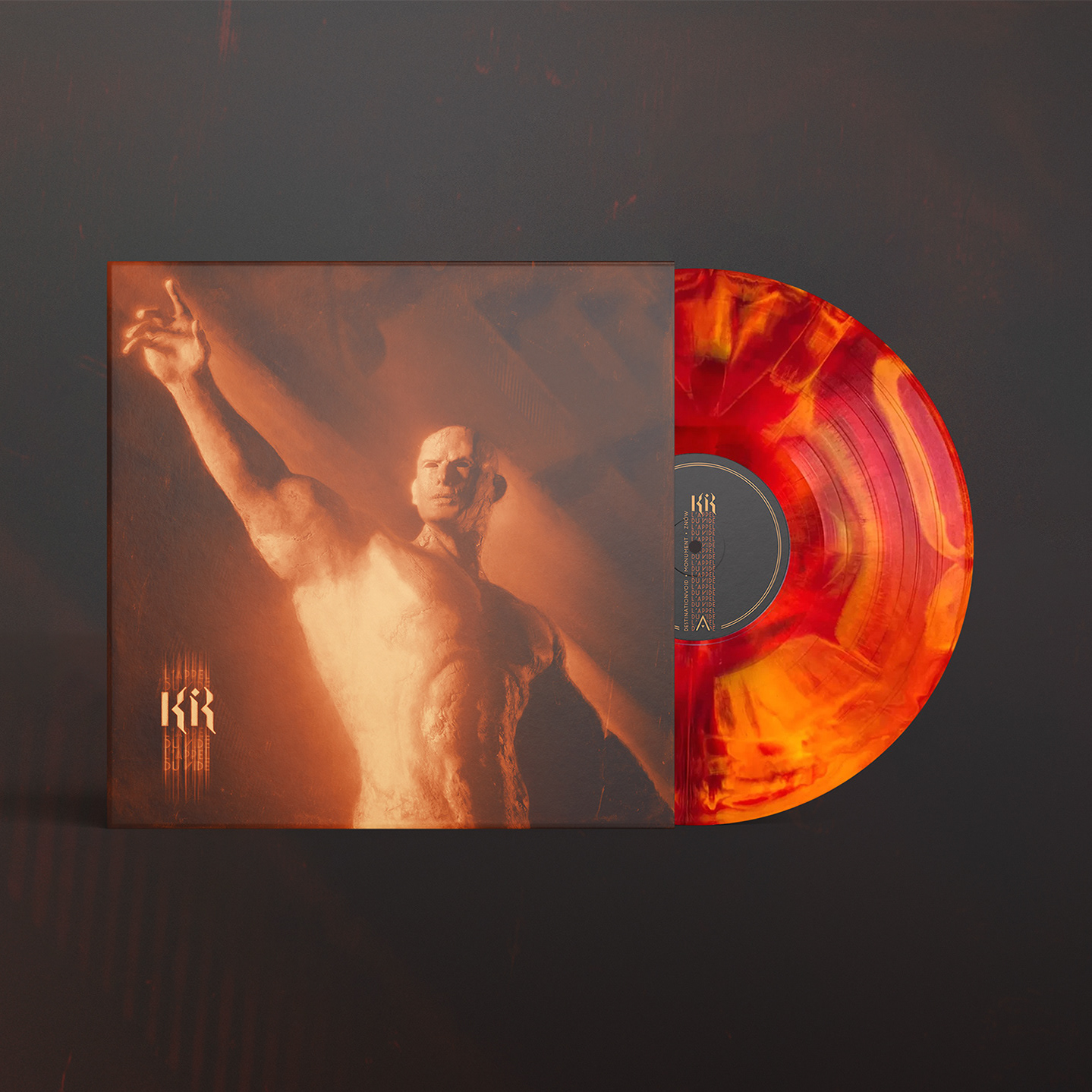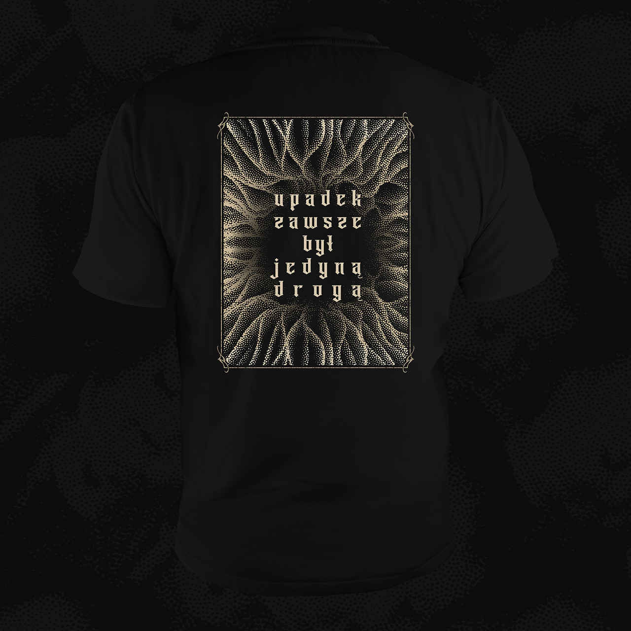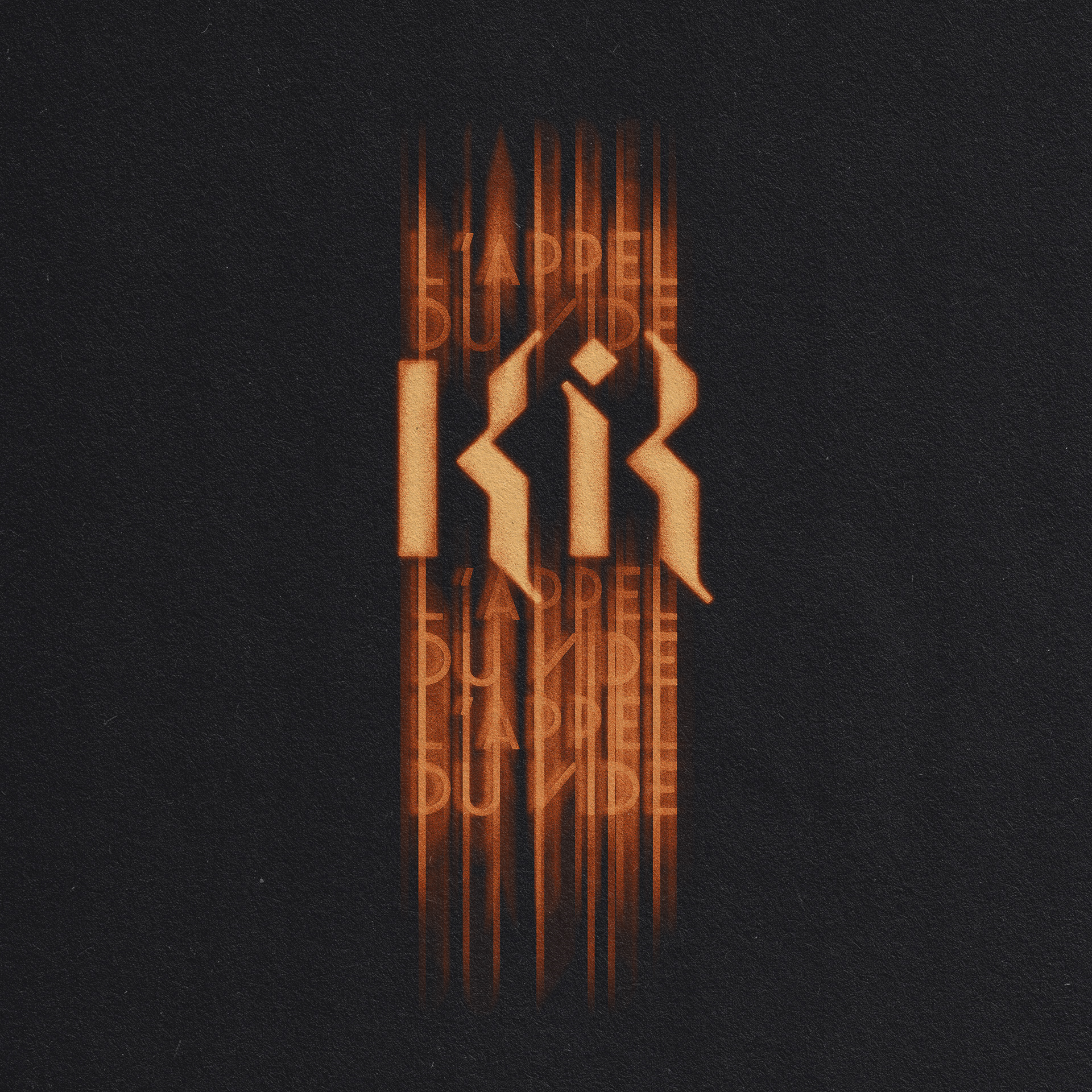
Kir - L'appel du vide emblem | 2024
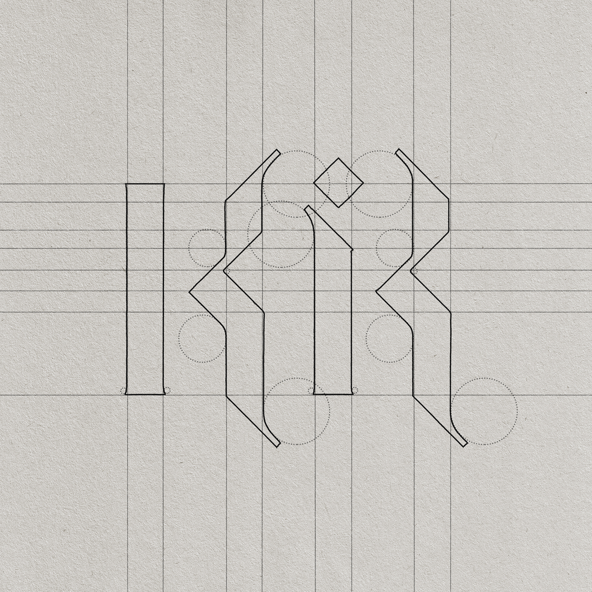
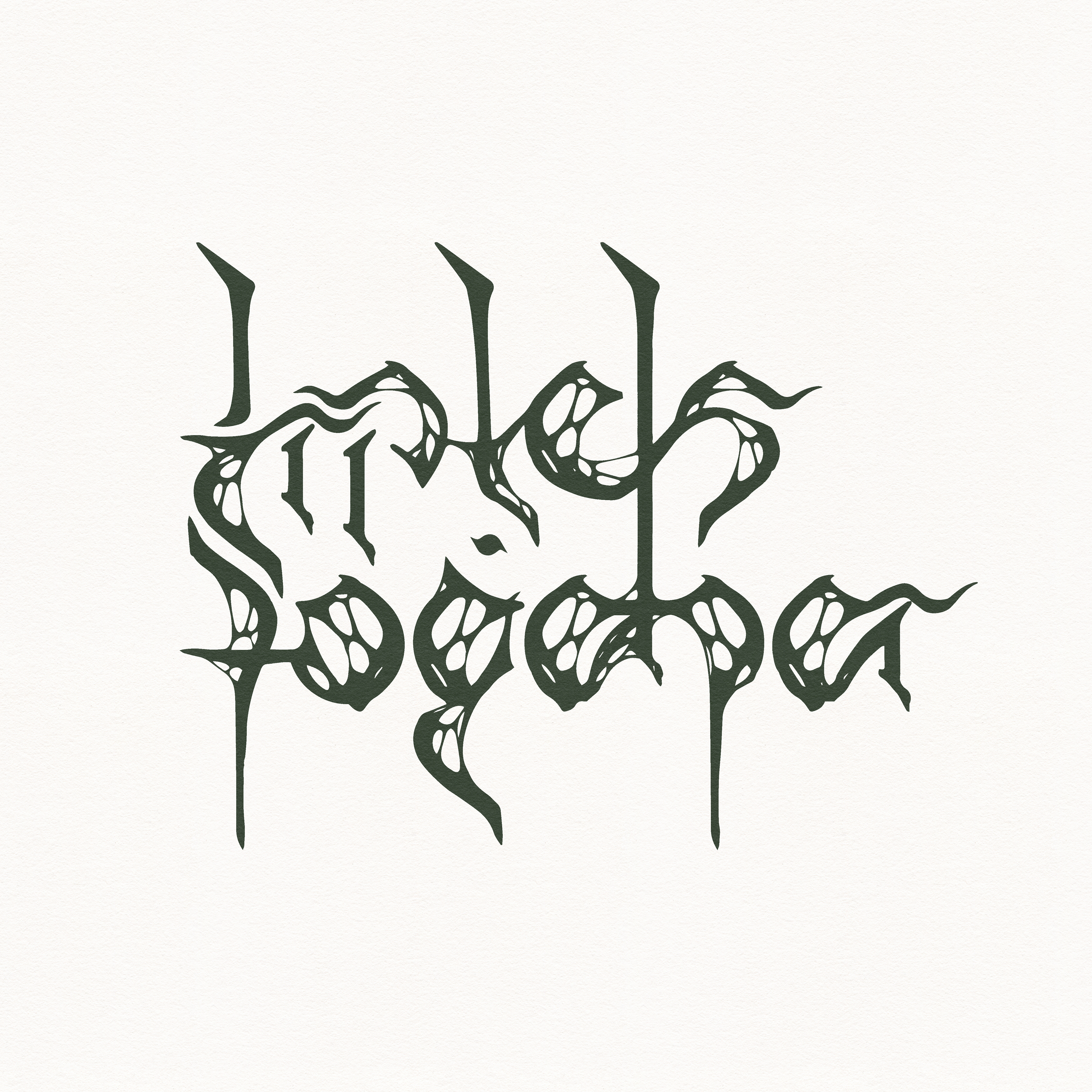
Here's what I call guerilla font making.
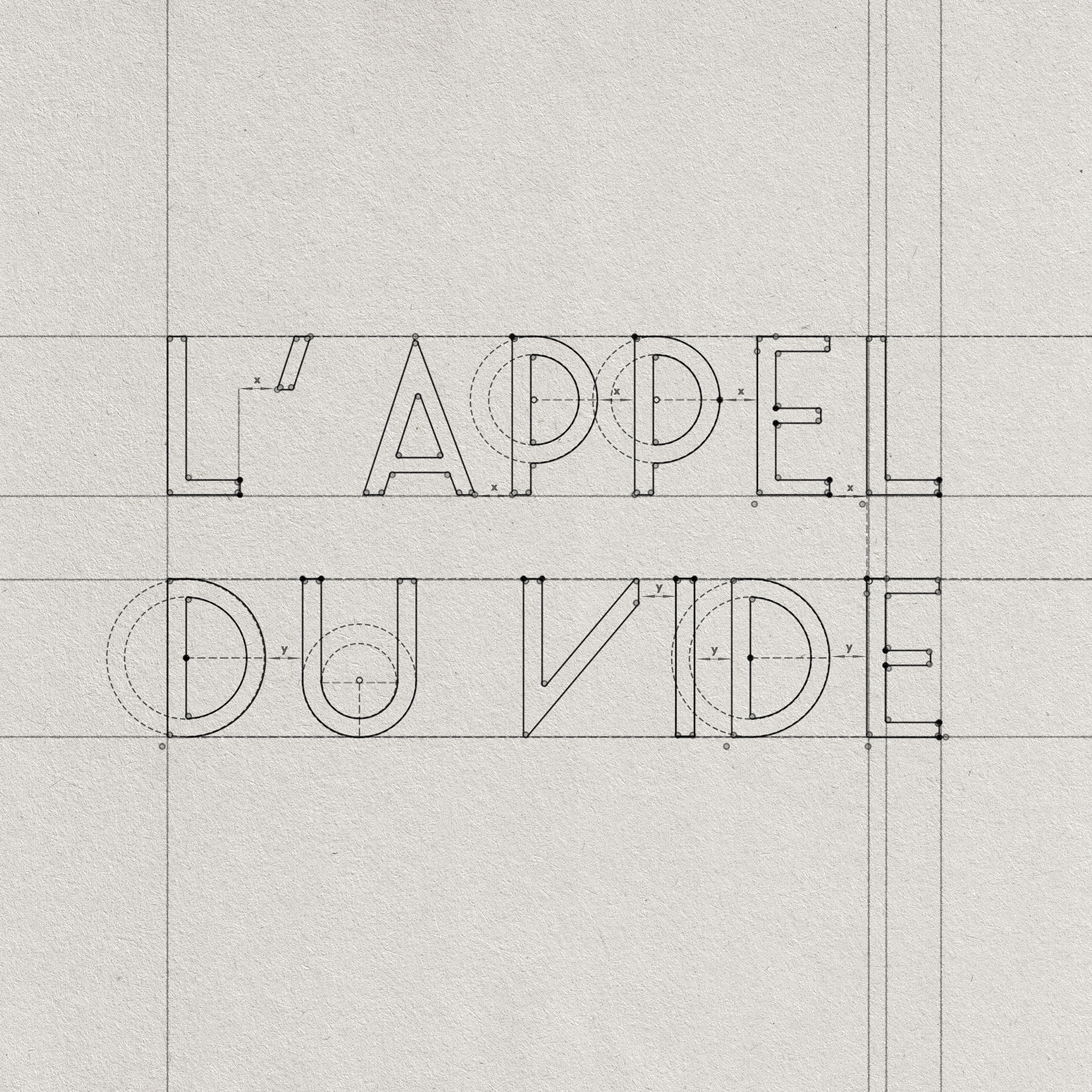
I couldn't find any typeface that would be close enough to what I saw out in town,
so I decided to design the typography myself.
so I decided to design the typography myself.
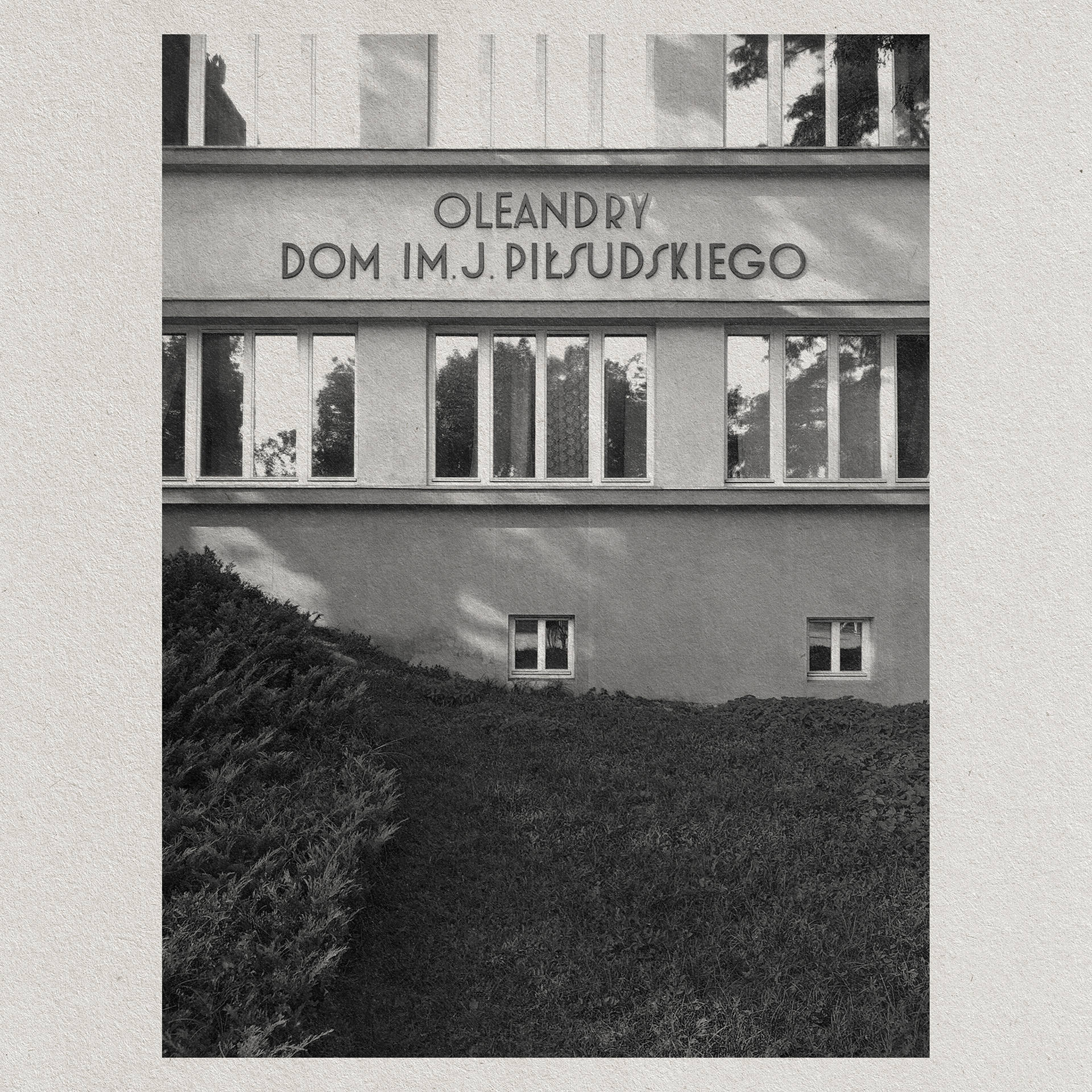
Letters are based on the writing on Oleandry façade in Kraków, Poland.
The emblem itself was made to echo traditional Black metal logotypes,
whilst incorporating Kir's logo and the aforementioned album title.
It's smeared silhouette mirrors the sonic qualities of album's production.
whilst incorporating Kir's logo and the aforementioned album title.
It's smeared silhouette mirrors the sonic qualities of album's production.