I led the design process from concept to final visual system.
Context
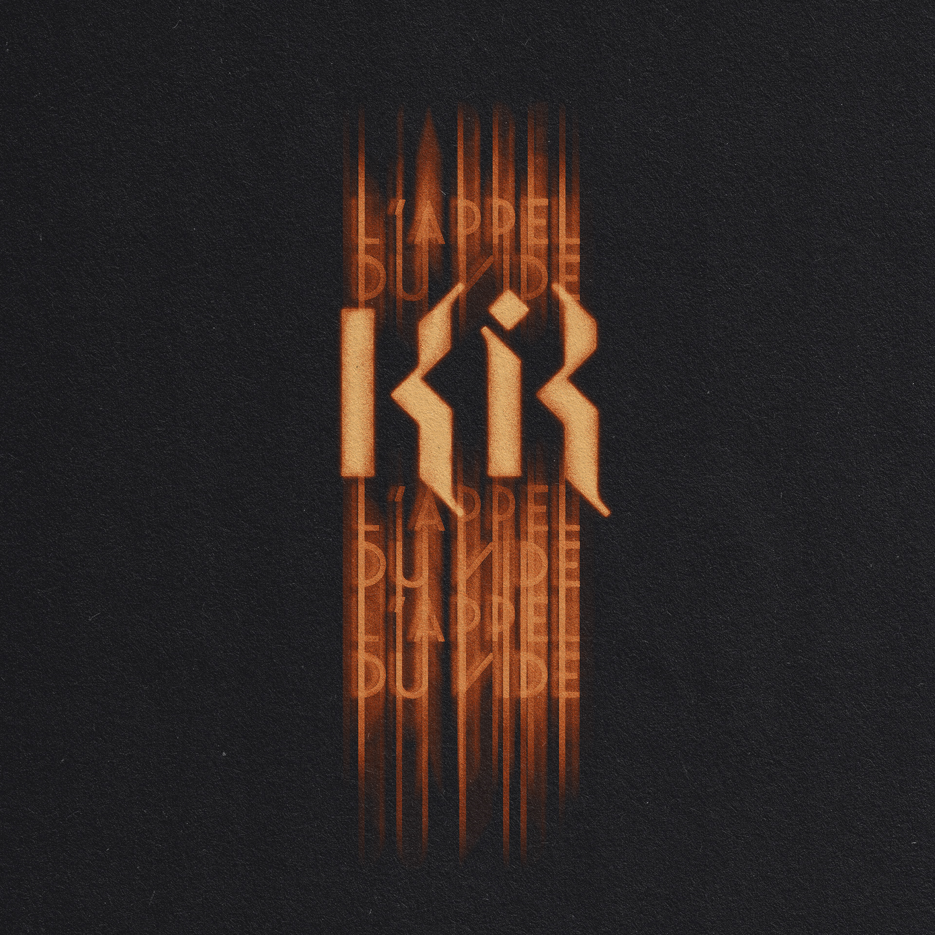
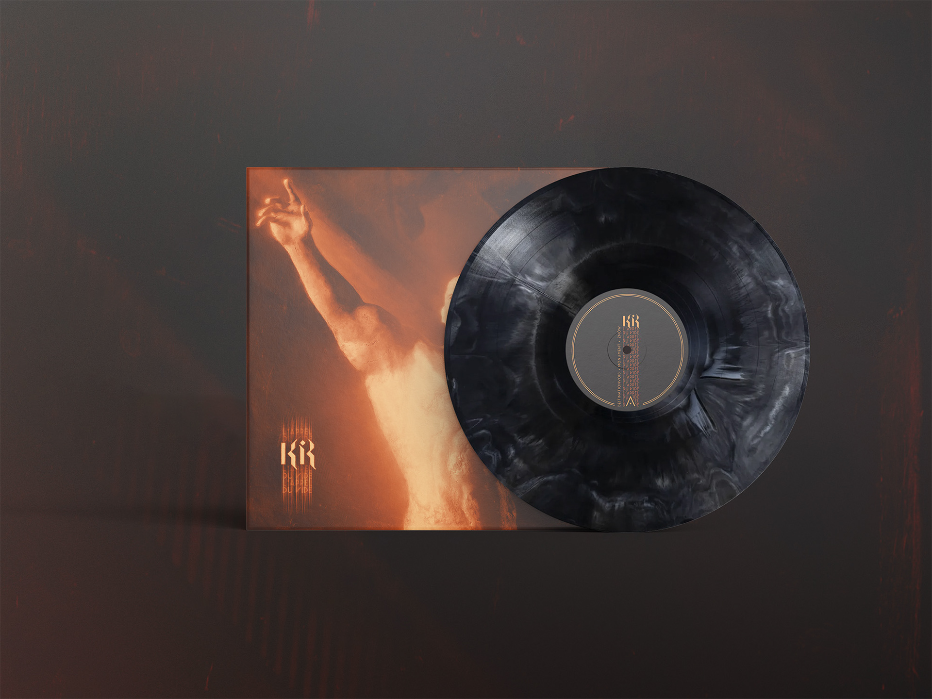
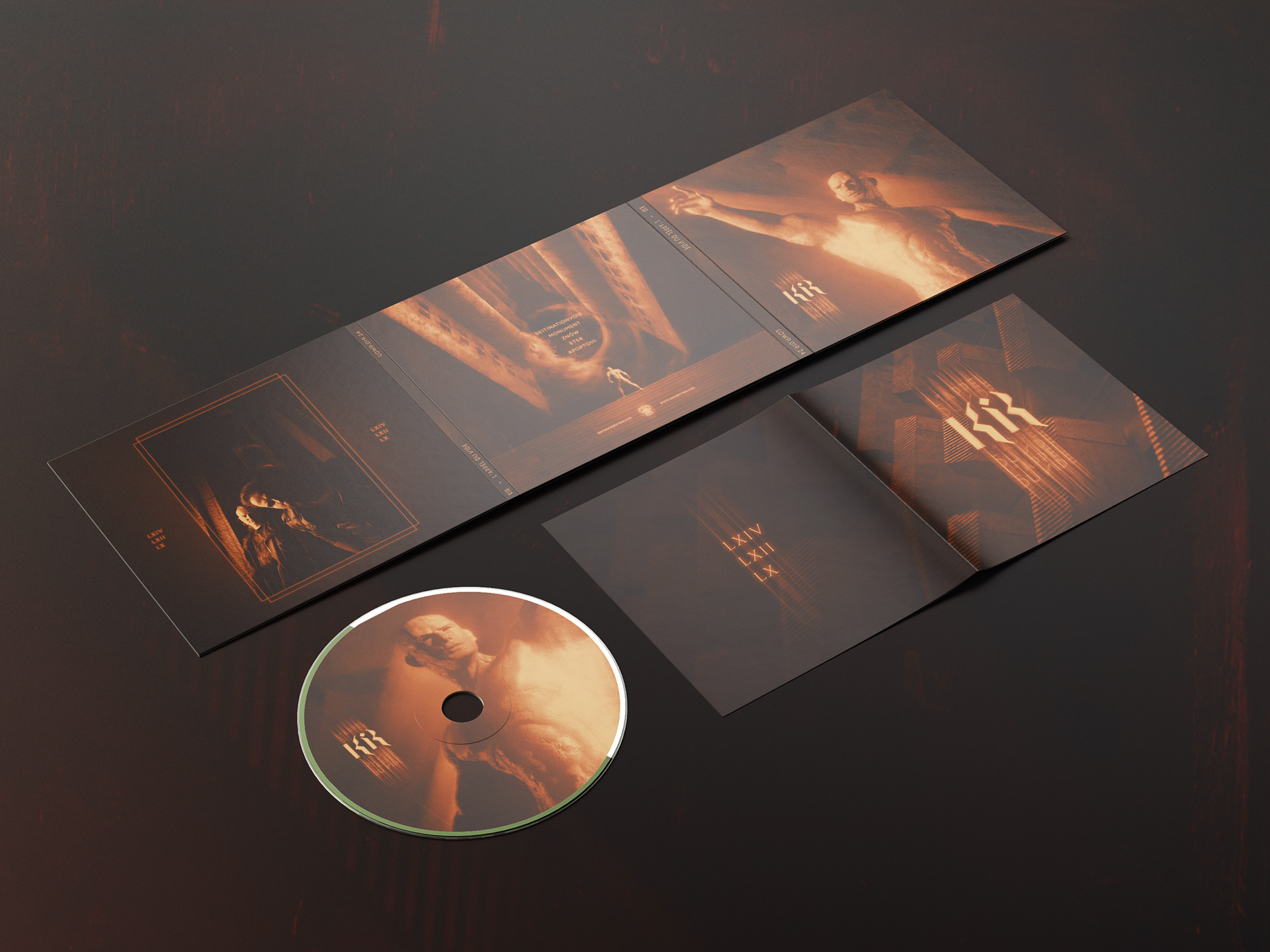
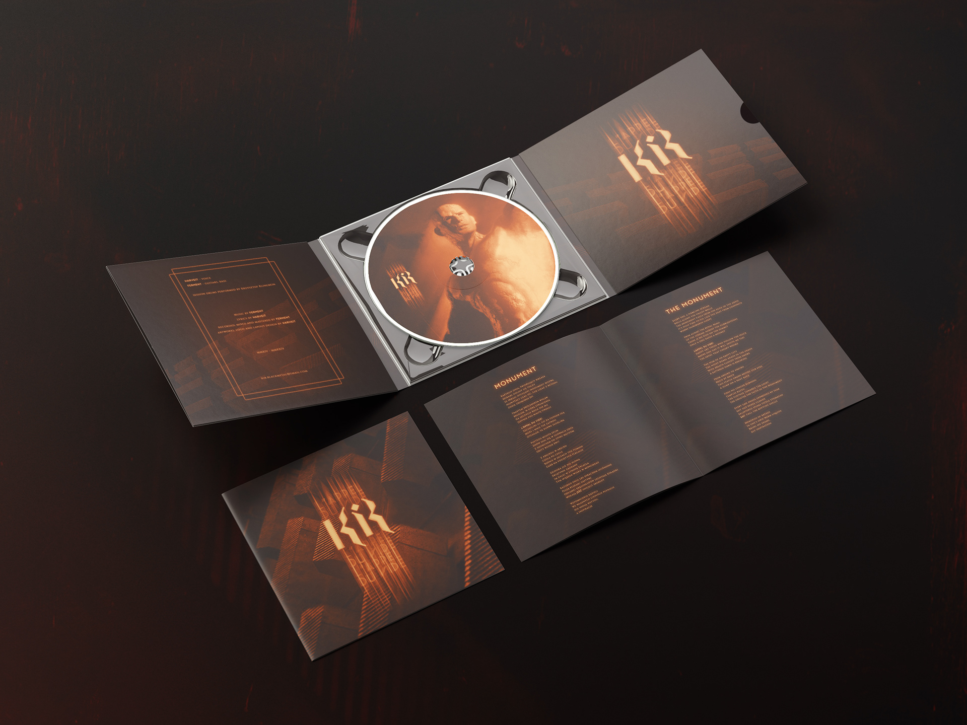
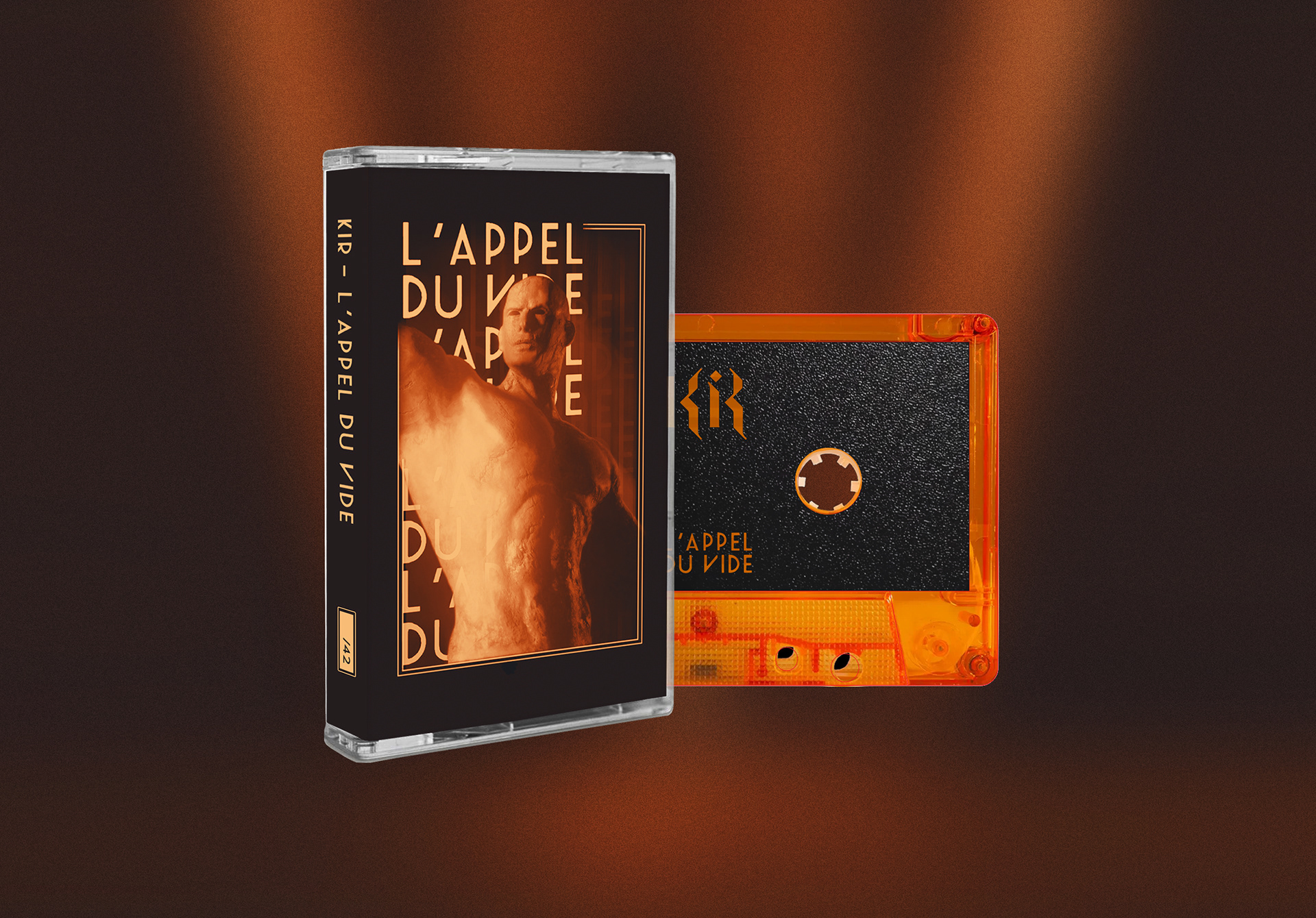
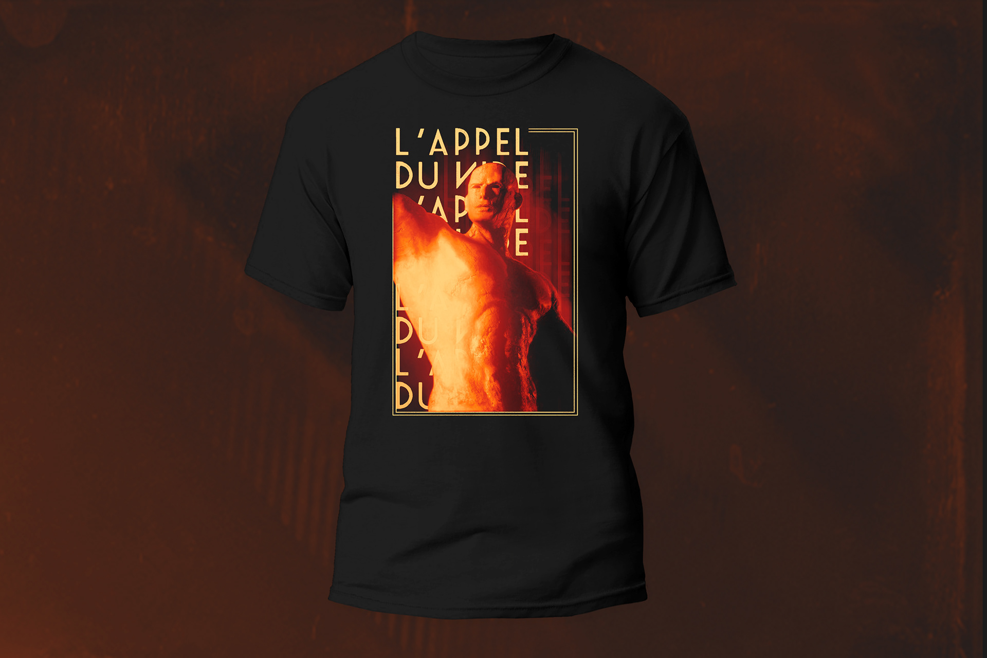
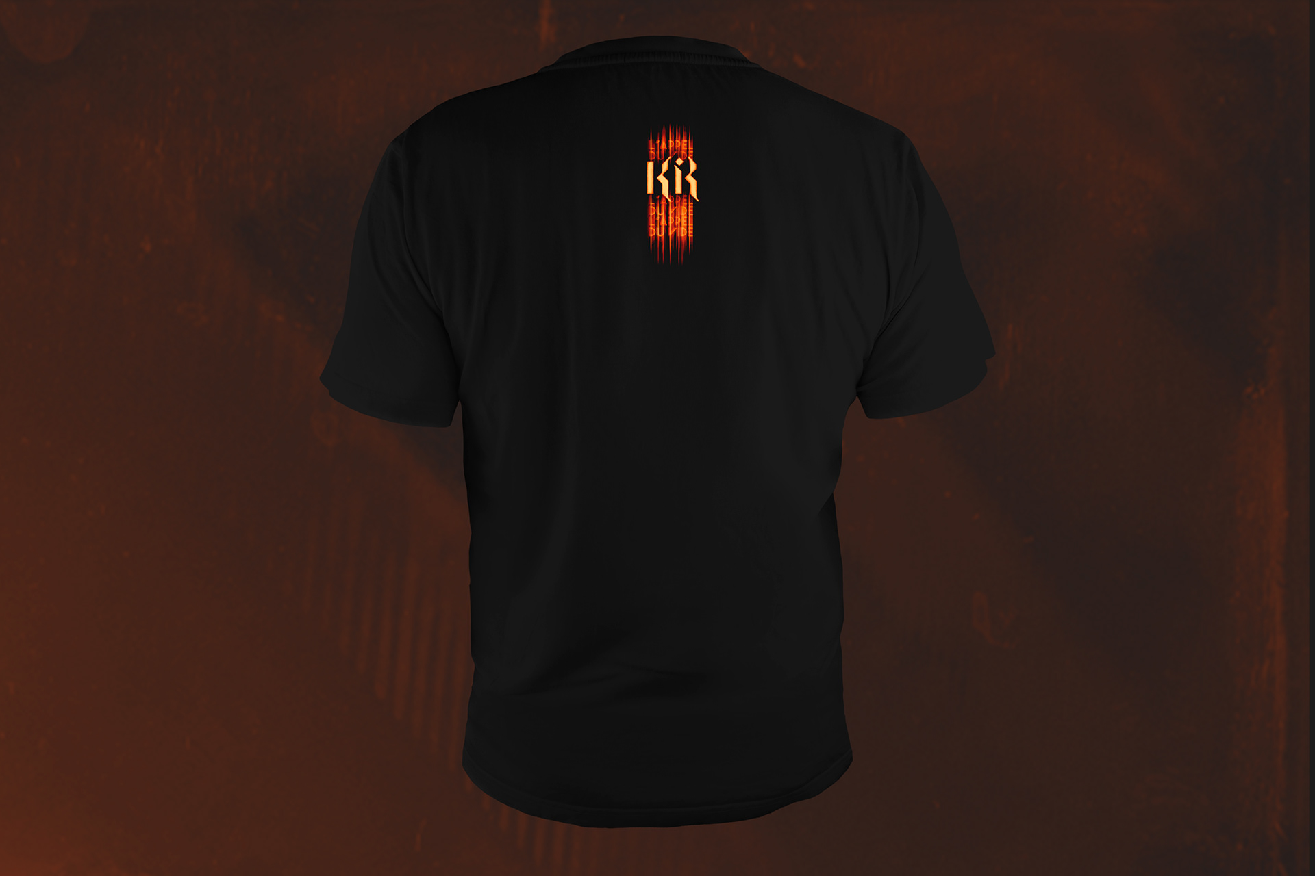
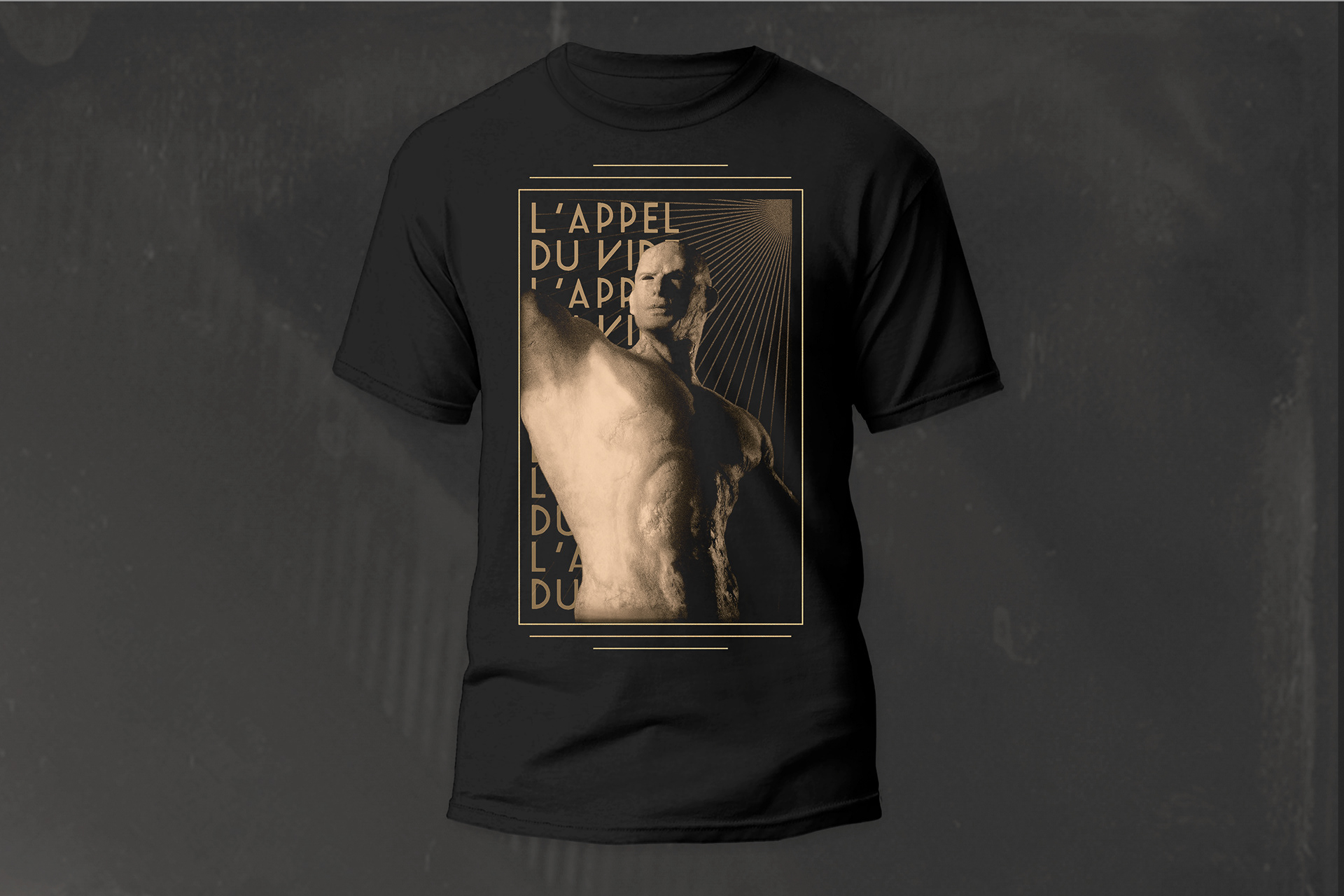
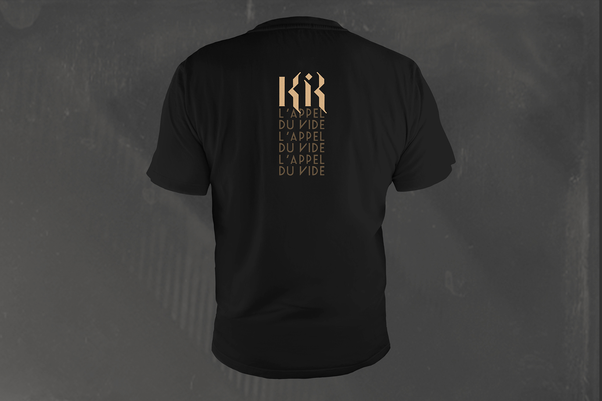
Kir is a band, which required a cohesive visual language, that would not only allow it to deliver its message with proper intentionality, but also differentiate it from its peers.
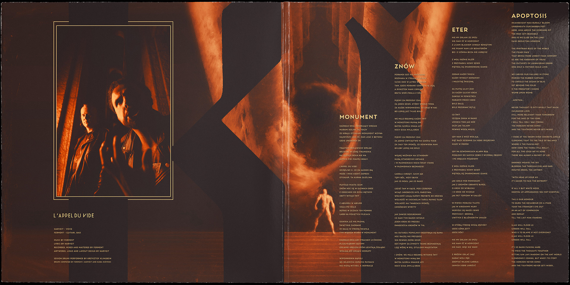
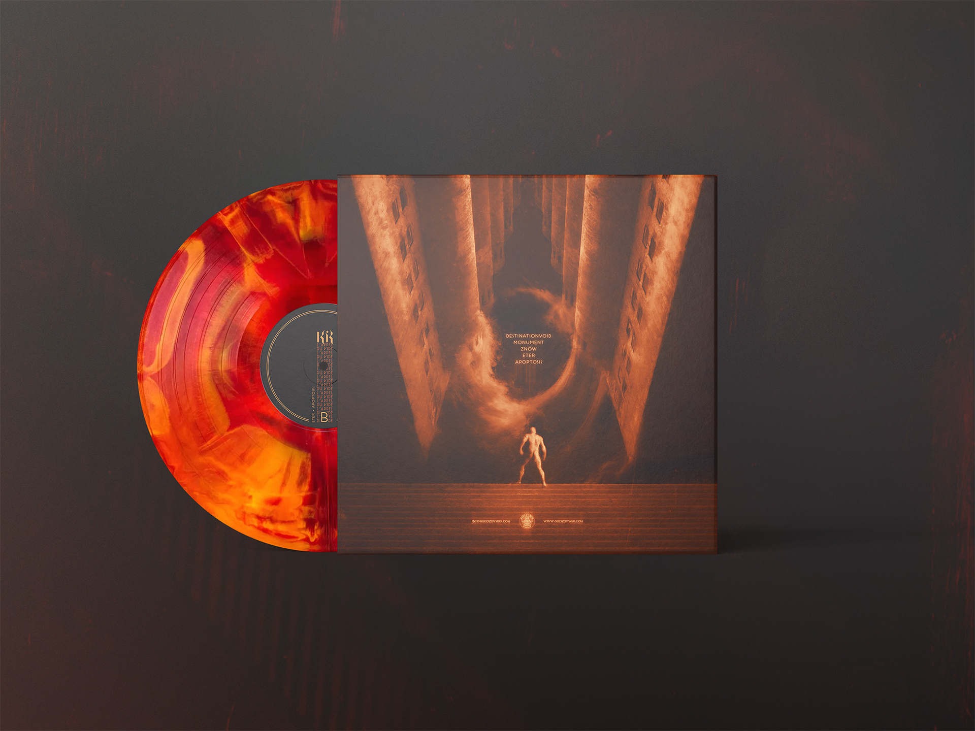
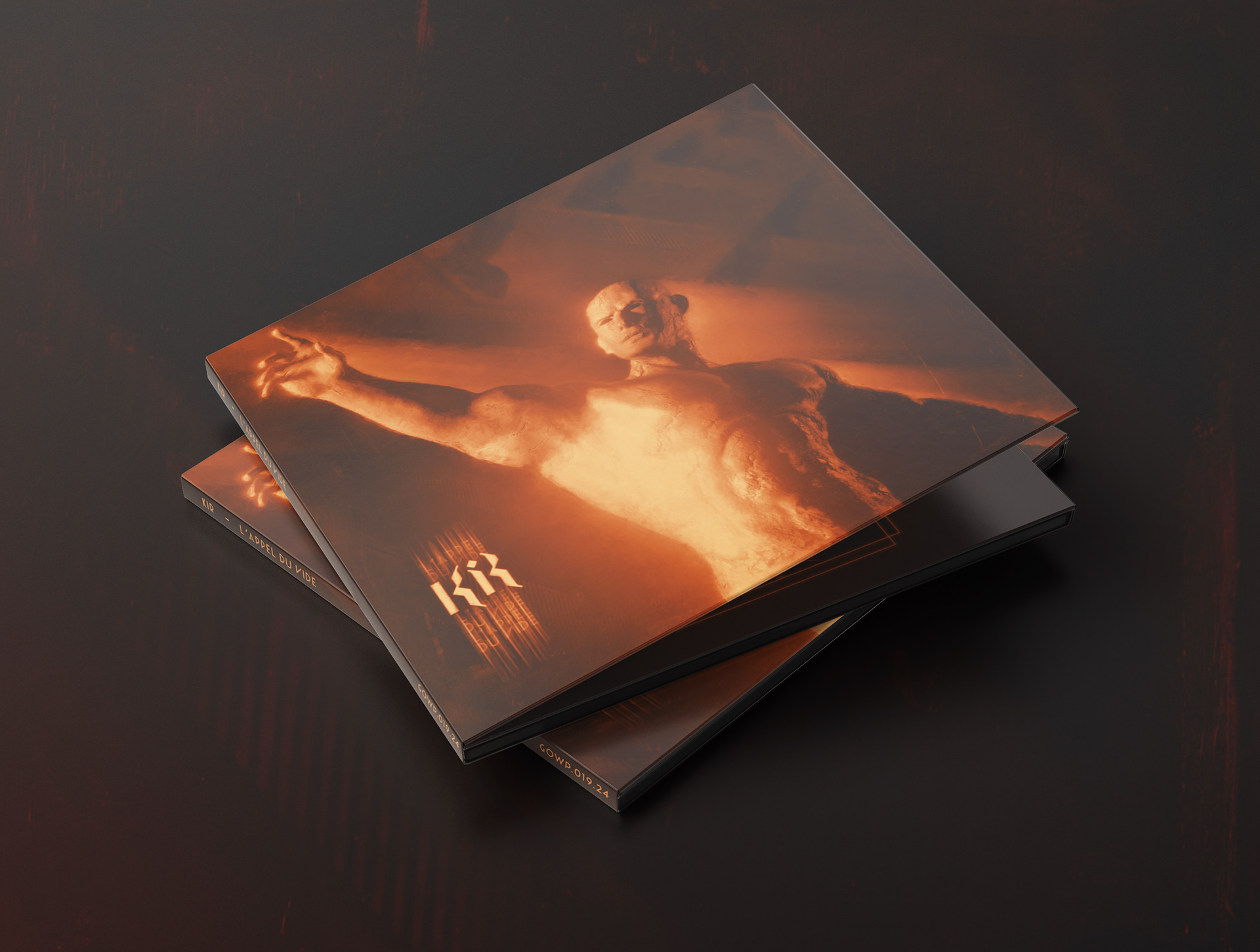
The visual language in question needed to remain legible both in digital media and in print.
Problem
Kir exists within a music environment heavily reliant on visual aspects, yet
Approach
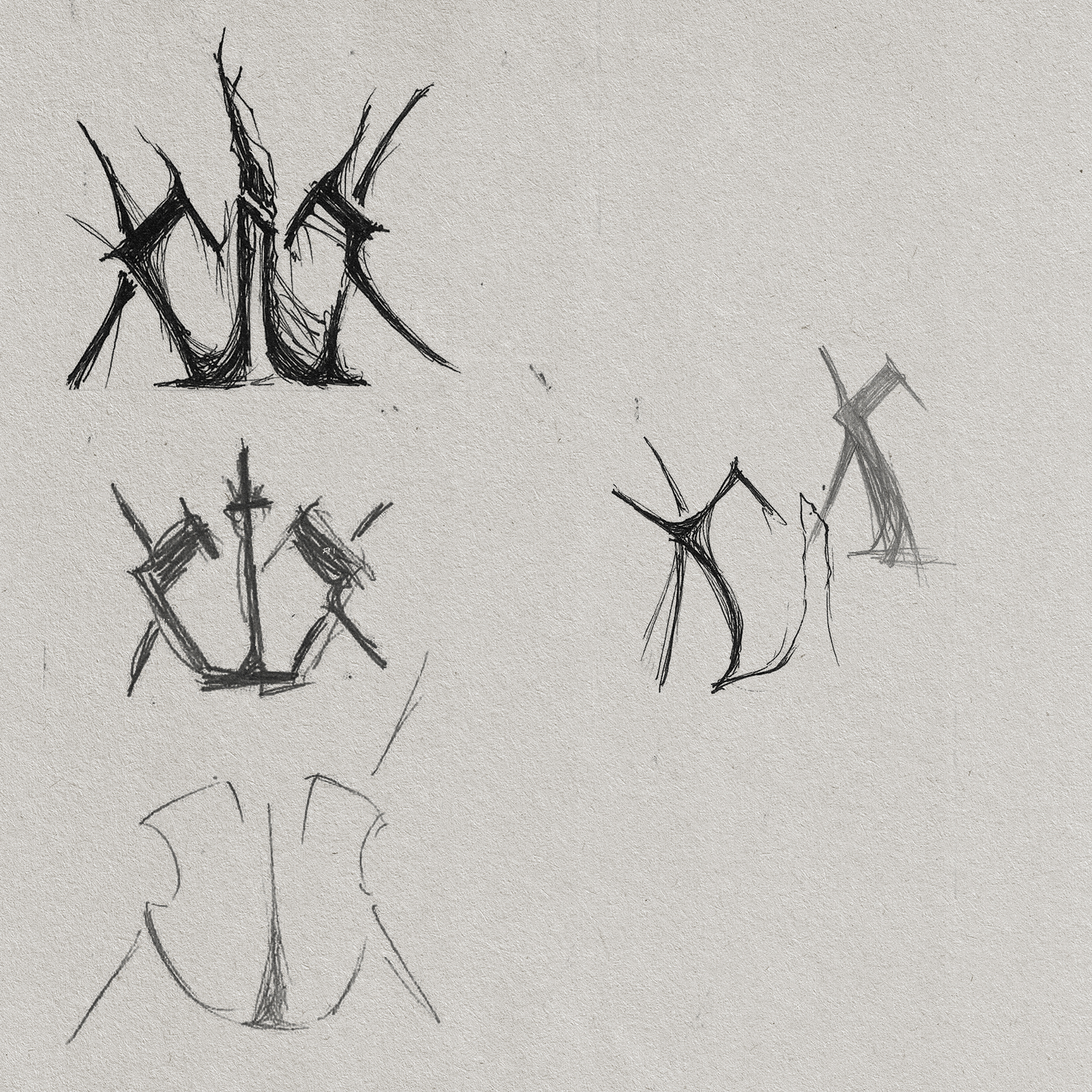
- Defining band's characteristics and message
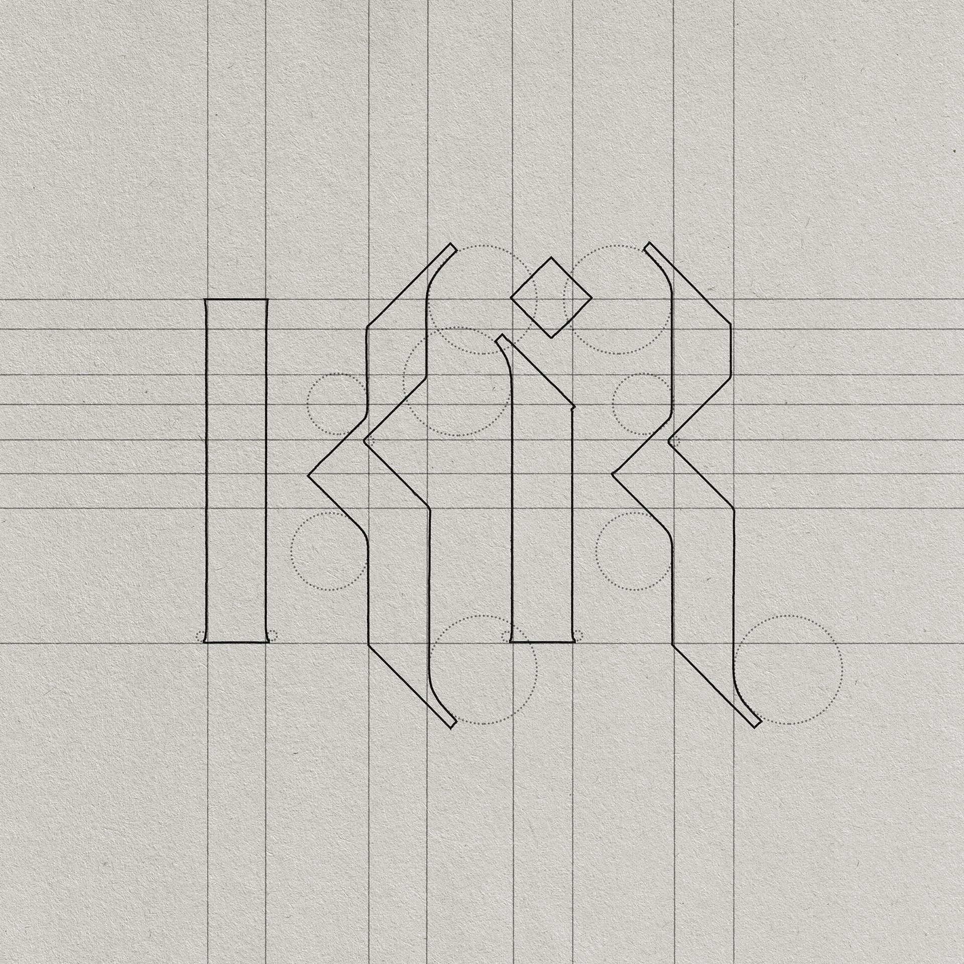
- Defining a scaleable visual system
Key assumptions
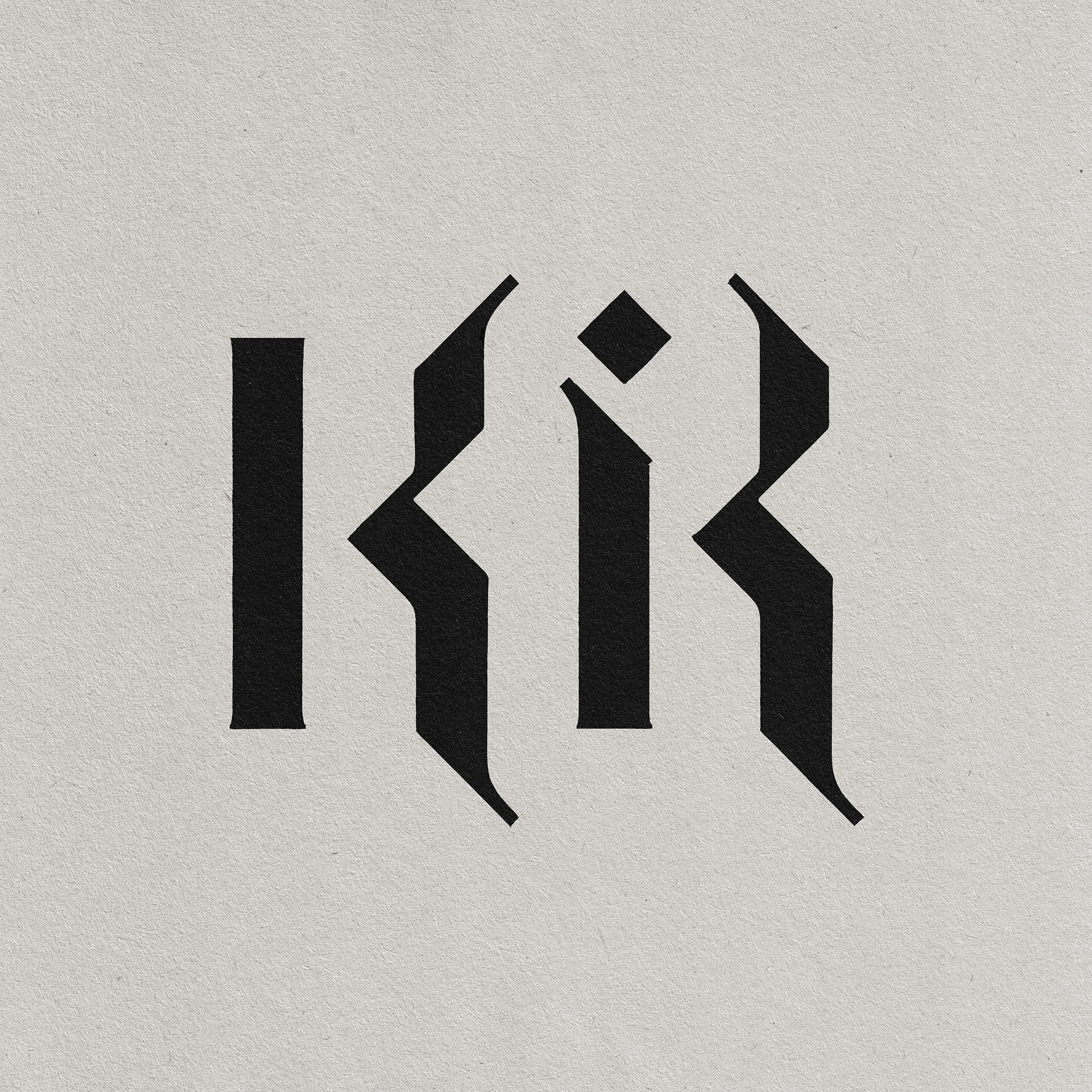
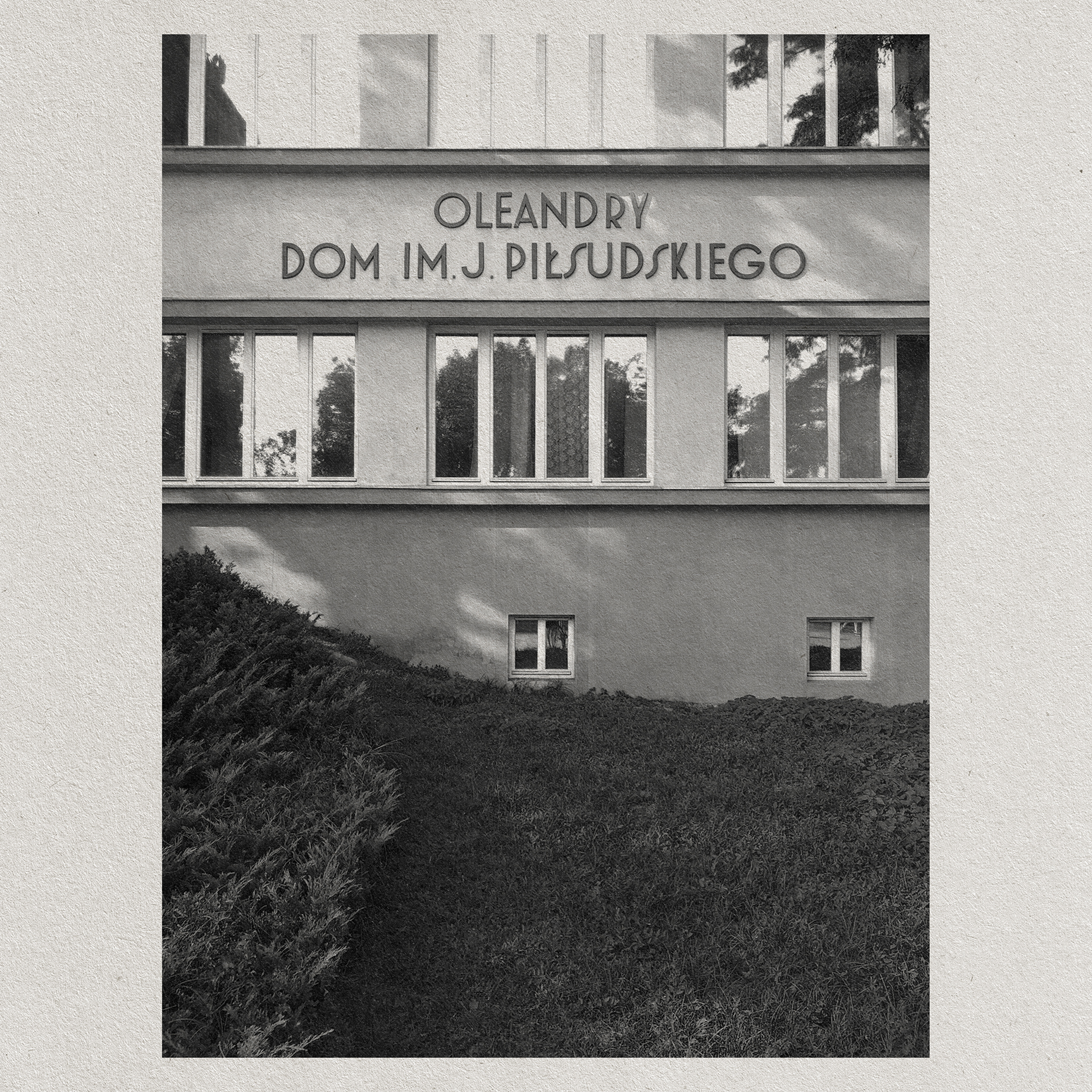
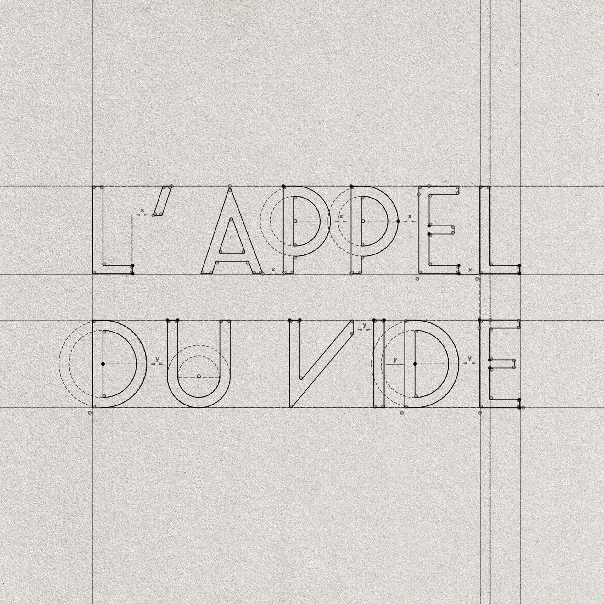
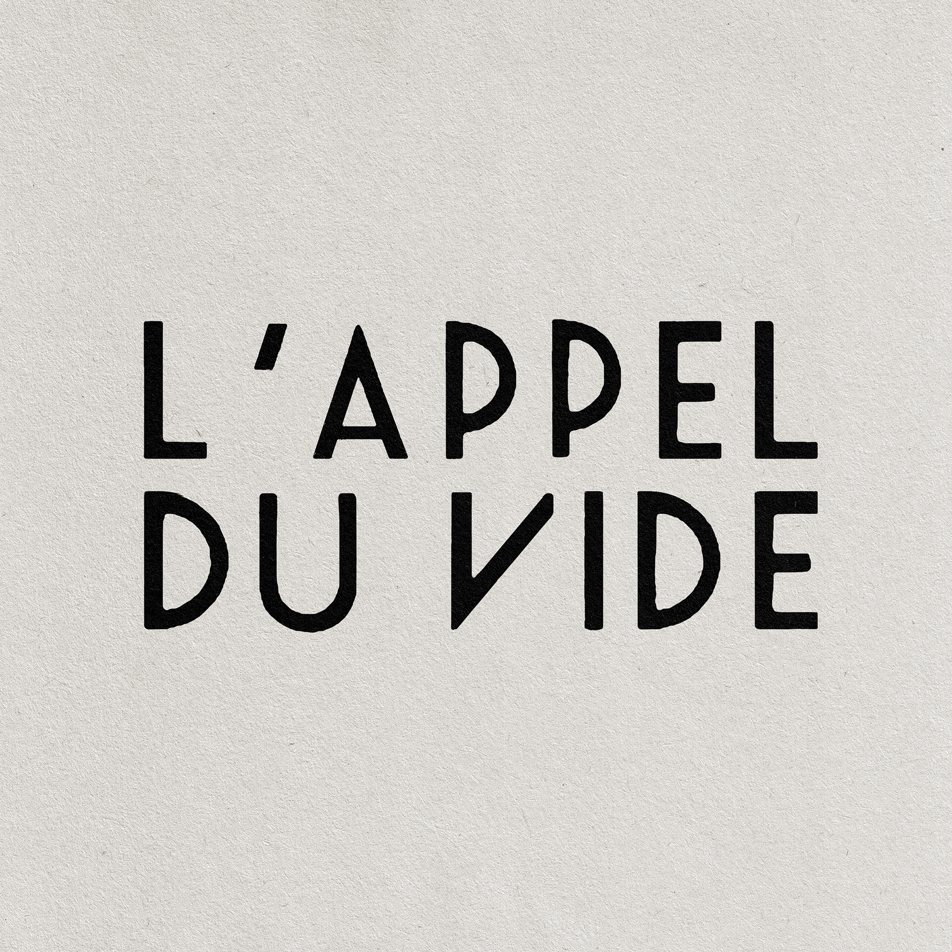
- Simple, institutionalised typography
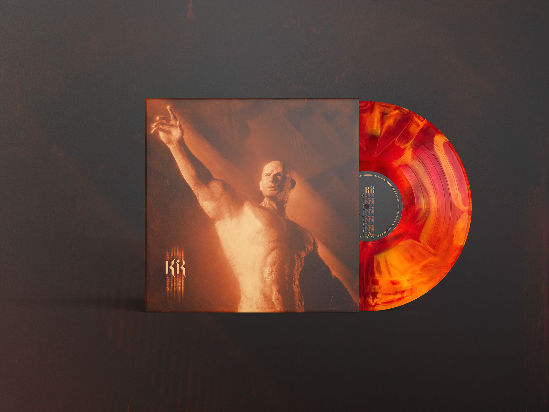
- Aesthetics and graphic style reflecting the grandiose sonic qualities of band's music
- Modularity
- Eye catching, contrasting colour palette